Usage
Defining how we apply color to user interfaces
The use of color plays a key role in how we convey emotions, establish brand identity, and guide user interactions. Consistent and thoughtful color choices also improve usability, highlight important elements, and create a cohesive design language across the product.
Border colors
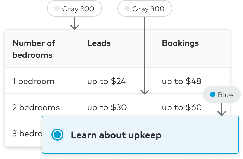
Borders are used in product design to visually separate or delineate elements, create hierarchy, and provide structure to the overall layout.
General principles
- Use neutral values on non-interactive moments
- Borders are not used with colored backgrounds to accentuate separation or elevation (excludes map overlays)
- Default border is Gray 300