Guidelines
Overview
A simple system for interfaces and illustrations
Colors play a crucial role in communicating status, guidance, and providing visual cues. Color should be used sparingly to drive focus to moments that matter. Color should not be used to add personality or flair.
| Neutral | 100 | 200 | 300 | 400 | 500 | 600 |
|---|---|---|---|---|---|---|
| Netural | ||||||
| Blue | core | |||||
| Green | core | |||||
| Yellow | core | |||||
| Red | core | |||||
| Indigo | core | |||||
| Purple | core |
Color themes
Our use of color can be defined in two major types classified as brand and feedback colors.
Brand colors
These colors are used to create a consistent visual identity and evoke specific emotions or associations within a design system.
| Value | Description |
|---|---|
| neutral | Use to express default and less-opinionated UI elements such as background colors, icons, and text elements. |
| primary | Use our brand color to tie in the most important user moments with how we express ourselves as an organization through our identity. You can also use these in info moments. |
| secondary | Use to communicate guide posts such as onboarding moments and newly introduced product features. |
| accent | Use as a subtle background for accent purposes. |
Feedback colors
These colors are used to help re-enforce important moments in the user journey that suggest or require additional guidance, gather user input, and improve the user experience.
| Value | Description |
|---|---|
| success | Use for positive monetary moments, like income patterns, discounts, savings, and revenue growth. |
| alert | Use to convey a sense of urgency, to assist in preventing potential errors or security issues, and for negative monetary moments like revenue loss. |
| caution | Use for moments that are trending in a negative direction, but don't require the user to take immediate action. |
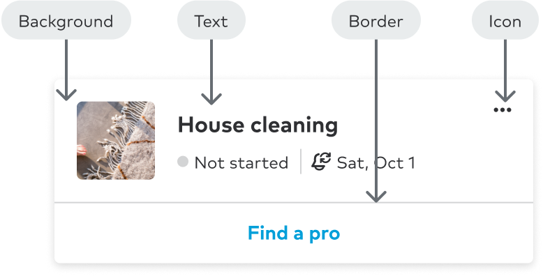
Color usage
Color usage is arranged into four high-level categories background, border, text and icon. Color usage patterns are represented by their intended use case.
| Value | Description |
|---|---|
| Background | Lowest level UI element where other UI element stack on top |
| Border | Stroke around container element |
| Text | Written language intended to clarity intention of element or interaction |
| Icon | Visual support for UI element |
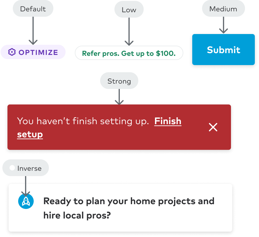
Emphasis
Not all experiences are treated equal. To provide varying levels of importance in conjunction with the hue, we use levels of emphasis to draw the users attention. A strong emphasis is high contrast in comparison to the surface the component occupies.
| Value | Description |
|---|---|
| Default | Approach with no variables introduced |
| Low | Visually subdued moments |
| Medium | Increased level of importance in the UI |
| Strong | High level of importance or impact |
| Inverse | Opposing end of default behavior |
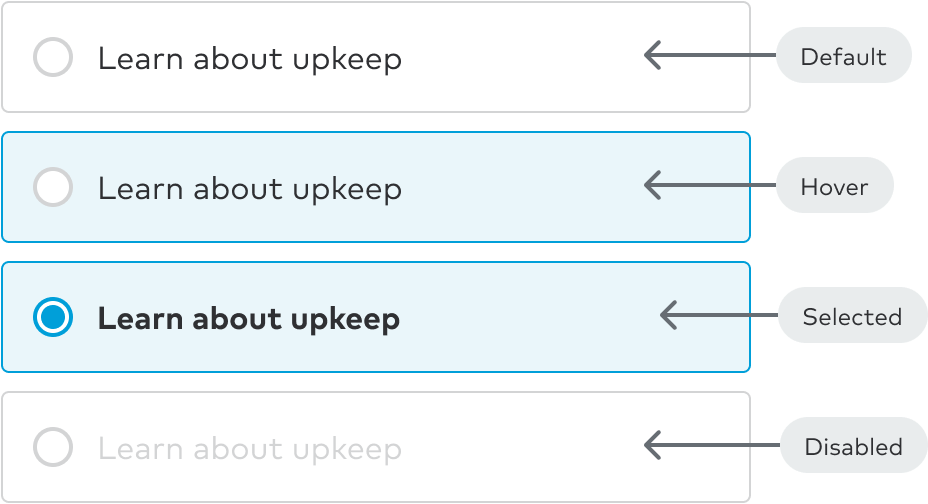
Interaction
Status such as hover, selected, disabled, and others describe how users engage with content. Not all elements are interactive, but our color usage patterns provide additional color definitions when applicable.
| Value | Description |
|---|---|
| Default | No user engagement has taken place |
| Low | Cursor is placed above the element |
| Medium | Enabled state after user has pressed |
| Strong | State of link after user has viewed href in their browser |
| Inverse | User can no longer engage with the element |