Guidelines

Usage

Defining how we apply color to user interfaces

The use of color plays a key role in how we convey emotions, establish brand identity, and guide user interactions. Consistent and thoughtful color choices also improve usability, highlight important elements, and create a cohesive design language across the product.

Background colors

Backgrounds foundational determine color usage hierarchically. Text, borders, and icon color usage will vary depending on the background surface color.

To build a sense of elevation, backgrounds can also be layered on top of one another. For example, a pill within a card can use color to build a visual indexing importance that can be dictated by color.

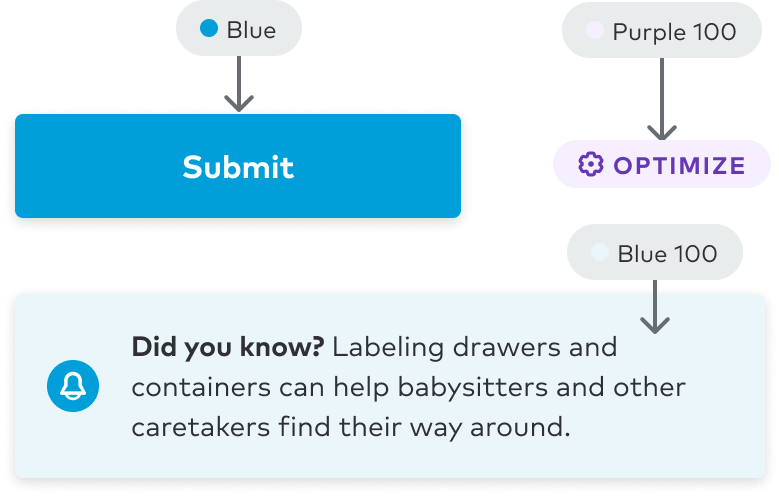
Levels of emphasis can also be used to further accentuate the importance of specific areas of the UI. By default, toasts use a high emphasis background to drive impact to meaningful and timely moments.

General principles

  • Use neutral values for pages/views
  • Core Primary color (Blue 400) is reserved for interactive elements (ex: Button)
  • Colors designated for feedback should be used sparingly
  • Avoid mixing color surfaces

Neutral

Use to express default and less-opinionated UI elements such as background colors, icons, and text elements.

ColorEmphasisInteractionDescription
Blue
mediumactiveSelected or active neutral backgrounds in smaller spaces (ex: Calendar days)
Gray 300
mediumMedium emphasis with no intention for color or feedback (ex: Messenger reply bubble)
Blue 100
defaultactiveSelected or active neutral backgrounds over default neutral backgrounds
Blue 100
defaulthoverInteractive moments when hovering over default neutral backgrounds
Black
strongHighly important messaging with no intention for color or feedback (ex: Toast)
Gray 200
lowSubtle awareness with no intention for color or feedback
White
defaultDefault background color with no meaning
Examples
user interface example where the netural theme is applied to element backgrounds

Primary and info

Use our brand color to tie in the most important user moments with how we express ourselves as an organization through our identity. You can also use these in info moments.

ColorEmphasisInteractionDescription
Blue 300
defaultdisabledDisabled primary backgrounds
Blue 500
strongHighest level of importance for primary moments
Blue 100
defaultBackgrounds for primary moments
Blue
mediumImportant primary moments (ex: primary CTAs)
Examples
user interface example where the primary theme is applied to element backgrounds
Add missing guidance to usage content mapping
ColorEmphasisDescription
Indigo 500
strongHighest level of importance for guidance moments
Indigo 100
defaultBackgrounds for guidance moments
Indigo
mediumImportant guidance moments
Examples
user interface example where the guidance theme is applied to element backgrounds

Accents

Use as a subtle background for accent purposes.

ColorEmphasisDescription
Purple 100
lowSubtle background for accent purposes
Examples
user interface example where the accent theme is applied to element backgrounds

Success, finance and ratings

Use for positive monetary moments, like income patterns, discounts, savings, and revenue growth.

ColorEmphasisDescription
Green 500
strongHighest level of importance for success moments (ex: savings, discounts, revenue growth, etc) and ratings
Green
mediumImportant success moments (ex: savings, discounts, revenue growth, etc) and ratings
Green 100
defaultBackgrounds for success moments (ex: savings, discounts, revenue growth, etc) and ratings
Examples
user interface example where the success theme is applied to element backgrounds

Alert

Use to convey a sense of urgency, to assist in preventing potential errors or security issues, and for negative monetary moments like revenue loss.

ColorEmphasisInteractionDescription
Red 300
defaultdisabledDisabled alert backgrounds
Red 600
strongHighest level of importance for alert moments
Red 100
defaultBackgrounds for alert moments
Red
mediumImportant alert moments
Examples
user interface example where the alert theme is applied to element backgrounds

Caution

Use for moments that are trending in a negative direction, but don't require the user to take immediate action.

ColorEmphasisDescription
Yellow 600
strongHighest level of importance for caution moments
Yellow 100
defaultBackgrounds for caution moments
Yellow
mediumImportant caution moments
Examples
user interface example where the caution theme is applied to element backgrounds