Components
Text Input
A control that allows single line text input
iOS (UIKit) is being deprecated
The single line text input control TextInput is build upon the built-in UIKit component UITextField.

let textInput = TextInput()
Properties
placeholder
The placeholder text that's shown when no text has been entered. Placeholder text is shown in gray.
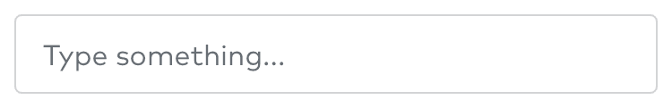
textInput.placeholder = "Type something..."
hasError
If true, the control will be red. Use this property if something's wrong and the text input control needs a user's attention.

textInput.hasError = true
isEnabled
If false, the control will not react to user interaction and will have a light gray color.
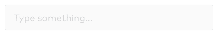
textInput.isEnabled = false
isHighlighted
If true, the control has a blue border.
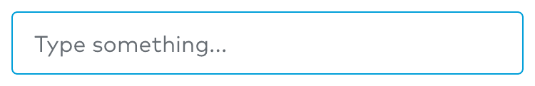
textInput.isHighlighted = true
leftView and rightView
These properties are inherited from UITextField and typically make it possible to show image based buttons on both sides of the text. More info can be found in the official UITextField documentation.

let leftView = UIButton(type: .system)leftView.setTitle("left", for: .normal)textInput.leftView = leftViewtextInput.leftViewMode = .always
clearButtonMode
This property is inherited from UITextField and determines when the standard clear button appears. More info can be found in the official UITextField documentation.
textInput.clearButtonMode = .whileEditing
hidesCaret
Suppresses the cursor display while the control is active.
textInput.hidesCaret = true