Components
Text Area
Multiline inputs for text
ThumbprintTextArea is a multi-line ThumbprintEditText. For iOS and web parity, this is referred to as a Text Area. Since ThumbprintTextArea inherits from ThumbprintEditTextBase, it shares common properties with ThumbprintTextInput.
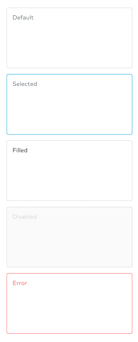
States
The following states are available for inputs: Default, selected, filled, disabled, and error.
Implementation
The following are the new attributes added on top of Android's default EditText:
hasError: Boolean. Indicates whether the Text Area is currently in an error state.isDisabled: Boolean. Indicates whether the Text Area is currently in a disabled state.state: Boolean. Returns the current state of the Text Area. Can not be set.