Components
Star Rating
Display a star rating out of 5.0
Examples
Standard
TPStarRating(rating: $rating, isInteractive: false)
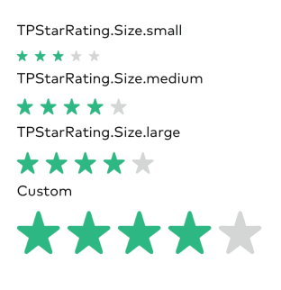
Size
/// Three standard sizes:/// small - 12/// medium - 18/// large - 24TPStarRating(rating: .constant(4)).tpStarRatingSize(TPStarRatingSize.small)// Configurable for any sizeTPStarRating(rating: .constant(4)).tpStarRatingSize(48.0)
Theme
TPStarRating(rating: $rating).tpStarRatingTheme(TPStarRatingTheme(filledColor: .tpYellow, unfilledColor: .tpGray))

Environment Values
.tpStarRatingSize(_ size: CGFloat)
Standard sizes defined in TPStarRatingSize
Default: - TPStarRatingSize.large
.tpStarRatingTheme(_ theme: TPStarRatingTheme)
Allows customization of the filled and unfilled star colors using TPStarRatingTheme.
Default: - TPStarRatingTheme.default (filled .tpGreen, unfilled .tpGray)
Initializers
public init(rating: Binding<Float>, maxRating: Int = 5, isInteractive: Bool = true)
rating: binding to a Float
maximumRating: the maximum star rating (defaults to 5)
isInteractive: configures the component to be read only
Accessibility
Component can be adjusted using VoiceOver gestures when isInteractive is true. Standard format is Select rating (current rating) out of (maximumRating) stars
When isInteractive is false, the format is Rating (current rating) out of (maximumRating) stars