Components
Fab
Buttons providing easy access to important actions
iOS (UIKit) is being deprecated
Thumbprint on iOS is transitioning from UIKit to SwiftUI, and this documentation is no longer being supported. Please refer to the SwiftUI documentation when available.
There are two floating action button components: TextFloatingActionButton and IconFloatingActionButton.
TextFloatingActionButton is used to display text and includes an option to add a UIView to the left of it.
IconFloatingActionButton is an icon or image only floating action button.
Theme
There are two standard fab themes on iOS. In addition, custom themes can be defined by calling the TextFloatingActionButton.Theme and IconFloatingActionButton.Theme constructors directly.
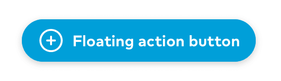
TextFloatingActionButton Primary
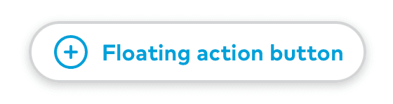
TextFloatingActionButton Secondary
IconFloatingActionButton Primary
IconFloatingActionButton Secondary
Public API
TextFloatingActionButton theme struct
public let backgroundColor: UIColorpublic let borderColor: UIColorpublic let tintColor: UIColorpublic let highlightedBackgroundColor: UIColorpublic let highlightedBorderColor: UIColorpublic let height: CGFloatpublic let horizontalPadding: CGFloatpublic let iconTextSpacing: CGFloatpublic let textStyle: Font.TextStylepublic let shadowImage: UIImage?public init(backgroundColor: UIColor, borderColor: UIColor, tintColor: UIColor, highlightedBackgroundColor: UIColor, highlightedBorderColor: UIColor, textStyle: Font.TextStyle = .title6, shadowImage: UIImage? = UIImage(named: "textFabShadow", in: Bundle.thumbprint, compatibleWith: nil), height: CGFloat = 44, horizontalPadding: CGFloat = Space.three, iconTextSpacing: CGFloat = Space.two)public static let primary: TextFloatingActionButton.Themepublic static let secondary: TextFloatingActionButton.Theme
IconFloatingActionButton theme struct
public let backgroundColor: UIColorpublic let borderColor: UIColorpublic let tintColor: UIColorpublic let highlightedBackgroundColor: UIColorlet highlightedBorderColor: UIColorpublic init(backgroundColor: UIColor, borderColor: UIColor, tintColor: UIColor, highlightedBackgroundColor: UIColor, highlightedBorderColor: UIColor)public static let primary: IconFloatingActionButton.Themepublic static let secondary: IconFloatingActionButton.Theme
TextFloatingActionButton
public private(set) var text: String?public func setText(_ text: String?, accessibilityLabel: String)public private(set) var leftView: UIView?public func setLeftView(_ view: UIView, largeContentImage: UIImage?)public var theme: Themepublic override var isHighlighted: Boolpublic init(text: String, accessibilityLabel: String, theme: TextFloatingActionButton.Theme = .primary)public override var intrinsicContentSize: CGSize
IconFloatingActionButton
public private(set) var icon: UIImage?public func setIcon(_ icon: UIImage, accessibilityLabel: String)public var theme: Themepublic override var isHighlighted: Boolpublic init(icon: UIImage, accessibilityLabel: String, theme: IconFloatingActionButton.Theme = .primary)public override var intrinsicContentSize: CGSize